An example of building a page from someone else’s design, Figma Community ·
A design in Figma that became a working page
The client has a design from a designer but no website: a design cannot be opened in a browser or sent as a link. Building the page from the design closes that gap, and this page can be opened right now.
The task
A common situation: the design is already drawn and paid for, and there is still no website. The design lives in Figma: it can be shown on a screen, but it can’t be sent as a link, opened on a phone, or, least of all, used to take requests. Between a pretty picture and a working page lies a separate piece of work, and it is not the designer who does it.
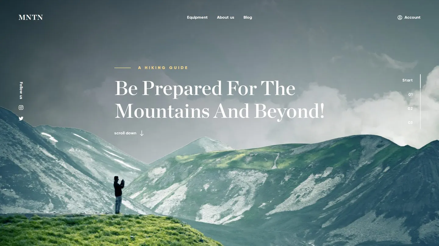
That work is what I show here. The page has no client: to keep the example honest, I took someone else’s design from Figma Community, one I was seeing for the first time, with nothing I could “make fit after the fact.” From there, everything goes as on a real job: a design in, a live page out, and the link opens.
Work like this needs to be looked at from two sides. The first is whether it looks the same. The second, which surfaces a month later, is whether it can be changed without rebuilding everything from scratch, and what will happen to the page on a phone, for which nobody drew a design.
What it delivered
A paid-for design stopped living in Figma and became a page that can be opened from a link and shown to anyone. Anyone who knows how to build web pages can maintain it: plain HTML and CSS, with no build tools and no admin panel, and an edit to a color or to spacing is one number in one file.
Where the built page usually drifts from the design
A “roughly similar” page can be built in an evening. The difference between “similar” and “the same” builds up in places the client does not notice right away, only when it is already too late.
The fonts were swapped silently
The design uses a paid typeface, the person building the page does not have it, and “something similar” from the free ones goes into the page. The client can’t always name the reason but sees that it now looks cheaper.
The numbers were taken by eye
Spacing and font sizes are taken approximately, and the gradient is matched with an eyedropper. Each is a trifle on its own; together they make a page that is “sort of the one, but not quite.”
Everything complicated went in as an image
It is easier to paste a complex scene in as one screenshot than to break it into layers. It weighs more and stretches worse, and neither a search engine nor a person will find the text inside an image.
One block built three times
Three identical sections are copied whole. Then comes an edit to one of them, and the page no longer agrees with itself, because nobody remembered to fix the other two.
The design had no phone version
Often a designer hands over only the desktop version. Someone will come up with the mobile version anyway; the only question is whether you will be told about it or presented with a done deal when the page falls apart on a phone.
What I did
First I broke the design down, then I started building
Before the first line of code, I went through the whole design and wrote down what it is made of: which sections there are, where the same blocks repeat, what is cheaper to deliver as an image, and what to build in code. This map sits in the repository as a separate file.
The point is simple: the three sections in the design are not three pieces of code but one block with three sets of content. The heading with a line appears four times, so it is defined once. After that, an edit to a color or to spacing is made in one place and takes effect everywhere at once, instead of being hunted for across the page by eye.
I carried the design’s values over as numbers, not by eye
All the colors, font sizes, font styles, spacing, and dimensions are kept in one file and taken from the design as they are. Even the gradient behind the first screen is recalculated from the Figma values rather than matched with an eyedropper.
The same file marks plainly what came from the design and what I worked out myself because the design did not have it. Six months on, that is a lifesaver: it shows which numbers must not be touched and which are my decisions and open to discussion.
I checked the result against the design’s coordinates
I compared the finished page with the design by coordinates, not by eye: where each block sits in Figma and where it ended up in the browser. The page height matched to the pixel, 4600 pixels in both; the differences block by block are no more than one pixel.
For the client, this means one thing: opening the page next to the design, they will see the design, not “an interpretation by the person who built the page.” The two places where I deliberately departed from the design are recorded in the repository along with the reason. For example, the size of one label in the header is brought in line with the other menu items, because in the design it was off for one item out of four.
I built the mountain scene in layers, not as one image
The first screen in the design is three mountain ridges, one behind another, with two dark overlays on top. They could have been pasted in as a single image and forgotten; instead, each layer lives separately, and the whole scene scales with the width of the window.
That is where the depth comes from: the heading stands between the layers, not on top of a flat image. And that is also where the leeway comes from: one ridge can be replaced or shifted without rebuilding the screen from scratch.
Three sections are one block, and the second is mirrored
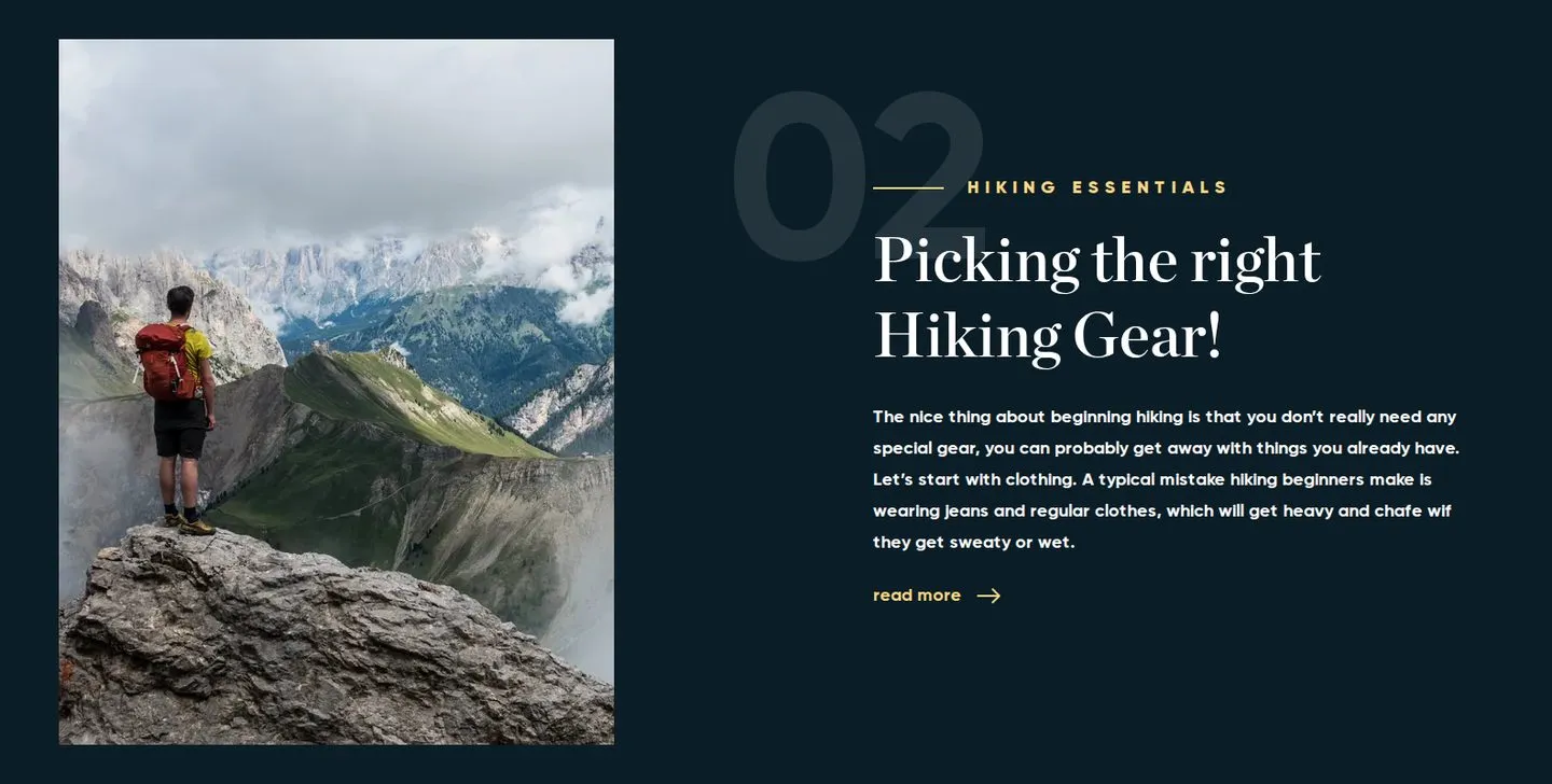
Sections 01, 02, and 03 are built the same way: a number, a heading, text, a link, and a photo. In the second one, the photo is on the left rather than the right; in the code this is not a separate copy but a switch on the same block.
The reading order does not change: someone who listens to the page read aloud or moves through it with a keyboard gets the heading first and then the text in both sections. Only the picture changes places.
I came up with the phone and tablet versions myself, and said so honestly
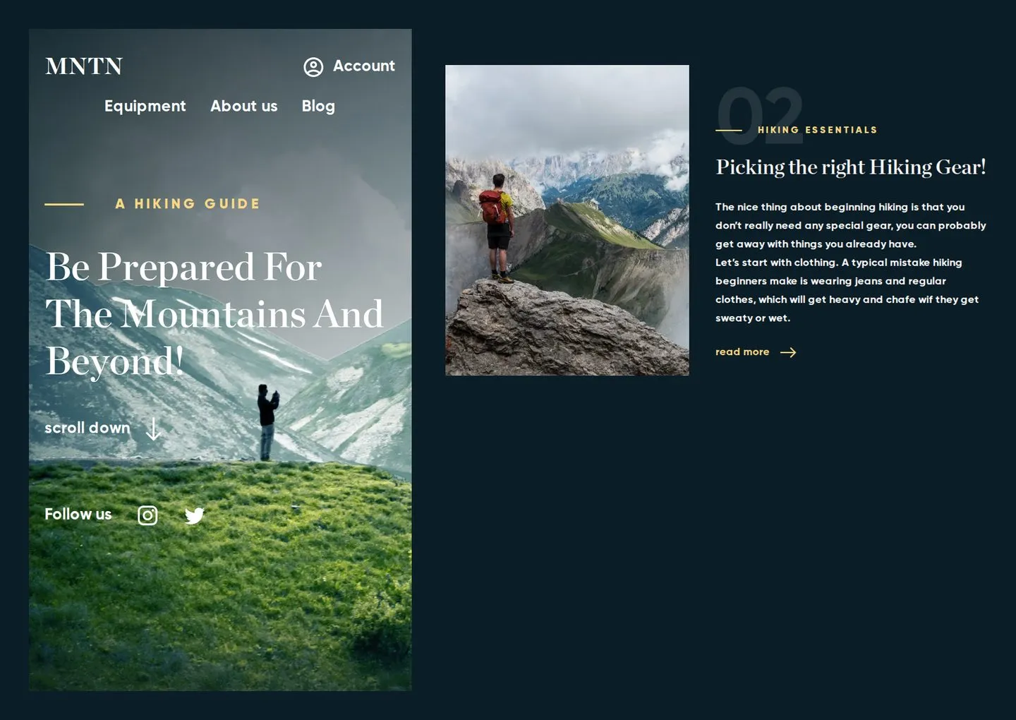
The design had only a computer screen 1920 pixels wide: no tablet, no phone, not a single hint of how all this should behave on a narrow screen. I put together the layout for them myself.
On a phone, the page runs in one column: the menu moves to a second line, the heading stays on top of the mountains, the photo goes above the text, and the vertical labels turn into ordinary ones. On a tablet, there is room for two columns, and the photo alternates (left, right, left) using the same switch as on the desktop. The desktop geometry, meanwhile, did not move by a single pixel.
This is not “as in the design”: it is not in the design. So both the repository and the handover say it in plain words: the phone and tablet versions are invented and need to be approved by the designer. A client should get things like this as a list, not discover them on their own a month later.
I added an entrance animation and marked it as an addition
As you scroll, the section cards slide in: the first from the left, the second from the right, the third from the left again. This is the only place on the page where a script runs: thirty lines that do nothing but watch for a card to appear on the screen.
It comes with two caveats, and both matter more than the animation itself. If a person has turned off motion in the device settings, there is no animation; the cards simply stay in place. If the script did not load or is turned off, the result is the same: the page stays readable, and nothing disappears. The animation here is decoration, not a condition for the site to work.
It is not in the design either, so it goes on the same list for approval as the phone layouts.
I carried the text over word for word, typos included
The original design has typos: an extra letter in one paragraph, two periods instead of one in another. I carried them over as they are and put them on a separate list for approval.
A person building the page who silently “fixes” the text is more dangerous than a typo: today they corrected the obvious, tomorrow it is a price or the name of a service. Edits to the text are made by the person it belongs to.
I did what a design doesn’t show
A design doesn’t show what happens when the pointer is over something, what the page looks like for someone who moves through it with a keyboard, or what to do with animation if a person has turned it off in the device settings. The person building the page decides all of that.
Every image got a text description, the buttons and icons got labels for those who can’t see the screen, links got a visible outline when reached with a keyboard, and smooth scrolling turns off if motion is turned off in the device settings.
Have a design from a designer and need a page like this, one that opens from a link?
Message meWhat this work did not include
This is purely building a page from a design, and it is important to name the boundary outright rather than leave the client to guess it.
This does not include any of the work that is done after the page is built and is usually a separate job: the page is not optimized for speed, not prepared for search, and not marked up for AI assistants’ answers, and neither analytics nor forms nor payments are connected to it.
Some of this is visible right away. There is no title and no image for when the link is shared: send the link in a messenger and you will see a bare address. There is no markup that tells a search engine what kind of page this is and what it is about. There is no icon for bookmarks.
Link addresses are a separate story: the design did not have a single one. Links to nowhere can’t be left on a live page, so I made the decision myself and recorded it in the repository: the menu items lead to sections of the page, the social media icons go to Instagram and Twitter, and the “read more” links, the account link, and the footer links open a “Coming soon” placeholder page with a way back to the landing page. On a real job, this is the first question for the client, not a place for my imagination.
One thing did turn out fairly well on its own: the first load takes about 0.7 megabytes, because the photos are served in a light modern format and load as you scroll. But nobody measured the speed or tuned it on purpose: that is a separate piece of work with its own result, and I will not pass off a lucky side effect as that work.
Building the page from the design answers the question “does it look and work like the design.” The questions “do people find the page,” “does it open fast on a weak connection,” and “what requests come in from it” are answered by the next layers of work. They are done on top of this one and can be seen in other case studies.
What you can check right now
This case study has no analytics numbers: the page was not promoted anywhere, it has no visitors, and there is nothing to count. But all of it can be checked, in full and without my involvement.
Open and compare
The page is at the link on the first screen. The original design is a public Figma Community file; anyone can open the two side by side and compare them.
Narrow the window
Just drag the edge of the browser or open the link on a phone to see the layout rearrange itself, and to see what those phone and tablet versions that the design did not have look like.
Look at the code
The whole repository is open: the page code, the design values, the breakdown map, and the work log. Any developer the client has can judge what they will be handed.
Read the history
The change history shows what was built and in what order: section by section, with a measurement after each.
Timeline: the whole page was built in one sitting on the morning of September 15, 2026. The first entry is at 7:21 and the last at 10:29, as the repository history shows. That evening, the tablet layout, the animation, and the link addresses were added: those are changes beyond the design, not the build from the design itself. A caveat is required: there was one design, desktop only, with no integrations, no text awaiting approval, and none of the work from the section above. On a real job, the timeline is calculated from the scope, not from this line.
What this gives the client going forward
Who maintains this afterward?
Anyone who knows how to build web pages. This is plain HTML and CSS with no build tools, libraries, or admin panel: the values are gathered in one file, and the sections are laid out in separate ones. The client’s developer will not have to figure out my habits to change the color of a button.
What if the designer sends an edit?
An edit to a color, a font size, or spacing is one number in one file, not a search across the whole page. A new section is put together from blocks that already exist: the heading with a line, the link with an arrow, and the card with a photo are already defined.
Can this be filled with content?
Yes, that is the next step. Right now the text and photos sit right in the page, as in the design. If a blog or a catalog is needed, the same page code becomes a template, and the content moves into files or an admin panel, with nothing to rebuild.
Where does a page like this live?
This one is on GitHub’s free hosting, and that is enough for it: the page is static, with no server and no database. A custom domain can be connected to the same hosting, and the domain is the only thing to pay for.
What carries over to a real job?
The whole way of working: a design breakdown before building, values as numbers instead of by eye, anything repeated as one block, a measurement against the design’s coordinates at the end, and a list of what the design did not have, sent to the client as a separate message. Only the design itself changes.
How it works technically
HTML and CSS plus one script, scripts/reveal.js (~30 lines), solely
for the entrance animation; there is no build tool and there are no dependencies, and the page works as
is, straight from the folder. The design tokens are in styles/tokens.css, the base and primitives
in styles/main.css, one file per section in styles/sections/, and the placeholder page
soon.html has its own styles/pages/soon.css. The design breakdown and the log are
docs/design-map.md and docs/progress.md.
The layout uses flex and grid; the mirrored section is a modifier with order, and the order
in the markup does not change. The mountain scene scales with the page width through
container query units (cqw) with a lower limit of 900px, and the layers are stacked
by z-index in Figma’s order; at widths from 1920px the heading goes under the mountains,
as in the design, and below that it stays on top, otherwise the mountains cover it. The gradient is recalculated
from gradientHandlePositions: −19.7°, stops at 31.1% and 108.9%.
Mobile-first, breakpoints at 768 / 1280 / 1920: up to 767, one column;
768–1279, two columns with the photo alternating through the same
feature--reverse and a two-column footer; from 1280, the design’s values.
The desktop values are taken from the design; the rest are derived and marked as such.
Animation: the script sets a class on <html> and, through IntersectionObserver,
marks a card when 15% of its height is visible; odd cards slide in from the left
and even ones from the right, with a shift of 40px on a phone and 80px on wider screens, 800 ms, and the transition is assigned
only to the entrance. With prefers-reduced-motion, the script does nothing. Photos are picture
with webp and a JPEG fallback, srcset at 1x and 2x, and loading="lazy" below
the first screen. Icons are an SVG sprite with currentColor. Fonts are local
woff2 with font-display: swap and preloading of the two first-screen font styles.
Accessibility: semantic sections, aria-label on navigation and icons,
:focus-visible, prefers-reduced-motion (both smooth scrolling and the card
animation). External links carry rel="noopener noreferrer", and the placeholder page is blocked
from indexing with noindex.
Publishing is GitHub Pages from a branch; no build is needed. The repository is open for viewing: the design, fonts, and photos belong to their rights holders and are there for demonstration only.
Who did the work
It’s just me behind jw-dev.pro, not a studio or an agency. That means you talk directly to the person doing the work: no manager, no brief relayed through third parties, and no passing the project to another contractor partway through.
My time zone is UTC+7, the same as Bangkok and Hanoi. I build websites, Telegram bots, and automation: a task rarely ends with a page, and it usually has to be connected to what you already have running.
As time goes on, the task sounds like “build a website” less and less often. One person needs a price to be changed in one place, not on twenty pages. Another needs the channel to run without them. A third needs the whole price list to sit inside Telegram, where their customers already go every day. That’s why the list of what I do is open-ended: if your task isn’t on it, that doesn’t necessarily mean it can’t be solved.
I write case studies so that they can be checked: what was there, what was done, and how it was measured. If there is analytics data, I give the numbers and the period they cover; if it is too early to measure, I say so. You won’t find “increased sales” here: that is a promise, not a result.
Need something similar?
Whether it’s a website, a bot, or something that is now done by hand, tell me what’s going on, and I’ll tell you whether it can be solved or not.
This kind of work is the service “Figma to HTML: a website built from your design.”
Your request was not sent
Your text is not lost: go back and try again. Or contact me directly: on Telegram, on WhatsApp, or by email.
If it’s easier, contact me directly: on Telegram, on WhatsApp, or by email.
Not sure what’s wrong with your website? Check it for free on Telegram: @jw_site_check_bot.
Who owns everything afterward and what happens if I disappear: answers on the home page.