Italian restaurant, Koh Samui, Thailand ·
The same restaurant website, but the menu is readable on a phone, and there are four languages
An Italian restaurant on Koh Samui. The words, the photos, and the evening mood are the same as before; the execution is new: the three-picture menu became text, and when the site opens, a phone downloads 0.3 MB instead of 6.4.
The business
Giulietta e Romeo is a family-run Italian restaurant in Chaweng, on the island of Koh Samui. It is an evening restaurant: according to its website, it is open Wednesday to Sunday, from six to ten. The kitchen is led by Italian chef Paola Ferrari. The name comes from “Romeo and Juliet,” and everything in the restaurant is built around it: candles, red roses, romantic evenings. After twelve years in North Chaweng, the restaurant moved to central Chaweng, where there are tables both indoors and by the pool, and started two new projects: by day, the La Dolce Vita bar serves breakfast there, and La Pasta delivers pasta to your door.
The restaurant’s website is meant above all for a guest on a phone: to look at the menu, see where the place is, and book a table on WhatsApp. On a resort island, that guest may be reading in a language that isn’t their own and using mobile internet.
This is not a commissioned job. The restaurant already had a website; I rebuilt it on my own initiative and showed the finished site to the owner. For now it lives at a test address that is closed to search engines: the link on the first screen leads there.
What it delivered
The website is still recognizable: the words, the photos, and the evening mood are the restaurant’s. And a guest on a phone sees the name straight away, reads the menu without zooming, fills in the booking form in one of four languages, and downloads many times less data. The numbers, and how I measured them, are in the “Results” section.
Where I started
The restaurant had a website with a good foundation: the text, the photos, the dark evening style, booking through WhatsApp. What got in the way was the execution, most of all on a phone, which is what a website like this is meant for above all.
At the time of publishing, the old website still opens at the restaurant’s address, so you can check everything below yourself. The “before” and “after” shots were taken on October 11, 2026, the same way: a phone screen 390 pixels wide and a computer screen 1440 wide.
The name wasn’t on the first screen
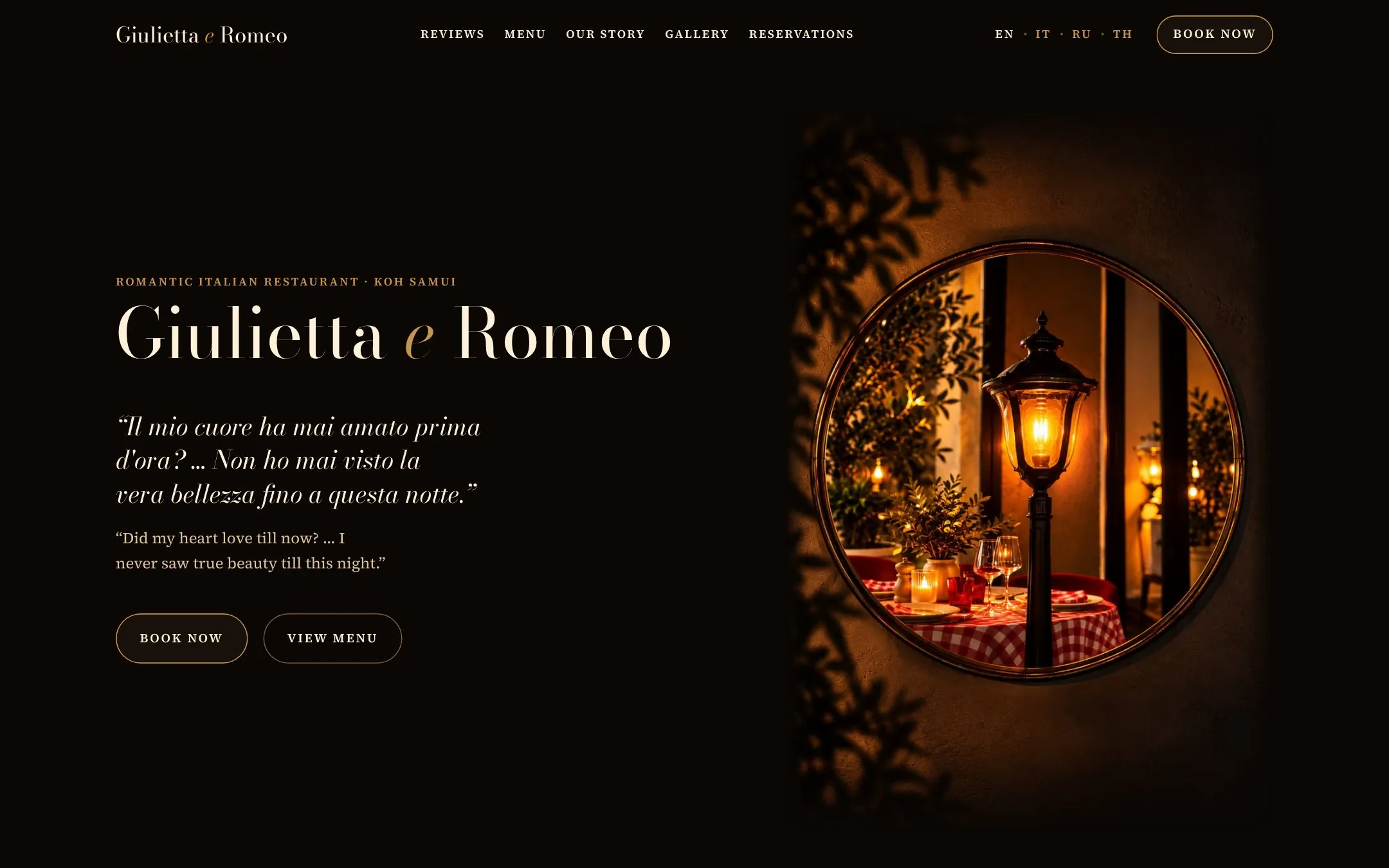
There was a photo with a lantern and a Shakespeare quote, but the restaurant’s name appeared only further down the page, first in the text of the story. The page had no main heading at all, and that heading is also how search engines tell what a page is about.
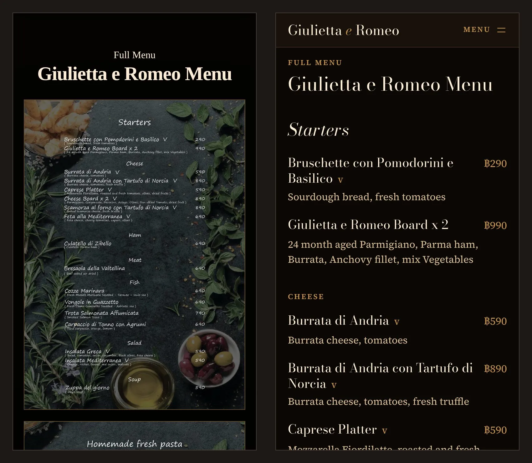
The menu was three pictures
On a phone, the menu picture is narrower than the screen, the dish descriptions are small, and tapping the picture doesn’t open it larger: you can only pinch to zoom the whole page. Search engines can’t find a dish in a picture like that, and the browser’s built-in translator doesn’t translate it.
The whole site was one heavy file
All 26 images were built right into the page. The phone downloaded them all at once, even the ones the guest would never scroll to, and any edit to the site, even a single price, would make it download everything again.
On a computer, a stretched phone
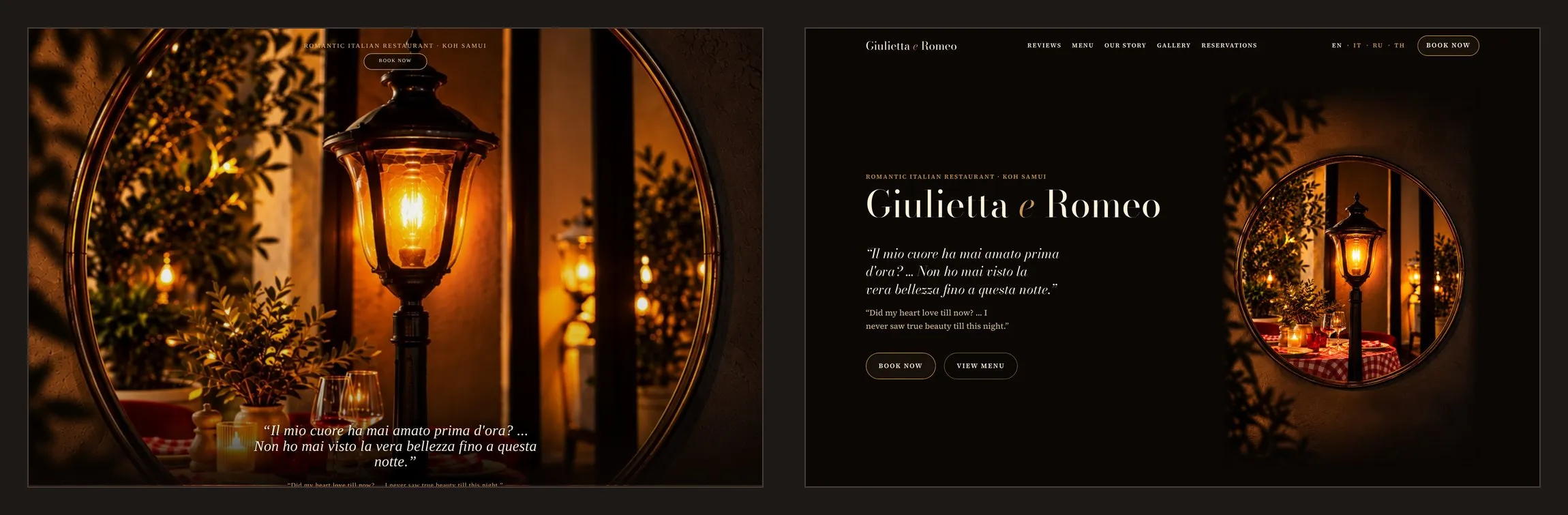
The same single-column layout, stretched across a big screen: no navigation, nothing left of the main photo on the first screen but the lantern, and the booking form on the tenth screen out of thirteen.
What I did
I kept the restaurant’s words, photos, and mood
The owner should recognize her website at first glance, so everything in it that was hers stayed in place. The English text of the page was carried over word for word, and the build checks it: if a single word differs from the original, the site won’t build. One thing in it changed: the number of reviews, which I updated from the review sites themselves. The menu is a separate story, covered below.
The photos are only the ones that were on the restaurant’s website; no new ones were added. The dark background, cream text and gold, the round window with the lantern, the Shakespeare quote in Italian and English: all of it is in place. What changed is the execution: the site’s own fonts, three kinds of buttons across the whole site instead of eight, one width for every block.
What matters most goes on the first two screens
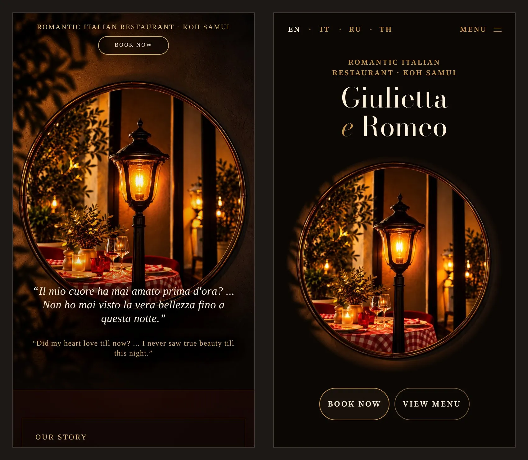
The restaurant’s name is the first heading on the page, right above the photo. Under the photo there are two buttons: book a table and open the menu. Booking is visible without scrolling even on small phones, down to 360 by 640 pixels, and a test checks this.
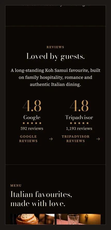
The blocks were rearranged; the text and photos are the same. The 4.8 ratings on Google and Tripadvisor were on the eighth screen of a phone, and now they are on the second: they help people choose where to go in the evening.
I typed up the menu as text, all 41 dishes
I typed up the three menu pictures as text: names, descriptions, and prices, as in the pictures. The typed text was checked twice, by different reviewers. Eight typos from the pictures were fixed, and the list of corrections went to the owner for confirmation: the menu text is hers, and she has the last word.
Now the menu is readable on a phone without zooming, and each price carries the baht sign. Search engines read the dish text, and the guest’s browser translates the descriptions on its own. Dish names aren’t translated: in every language they stay as they are on the restaurant’s menu. The six category photos became buttons: tap “Pizza” and you are in the pizza section.
Computers get their own version
Instead of a stretched phone column, there is a site built for a big screen. At the top is a header with the sections, the languages, and a booking button; it stays in place while the guest scrolls. The name is large, and the main photo is visible in full. The opening hours and the booking form stand side by side and fit on one screen, whereas before, the booking block took up almost two.
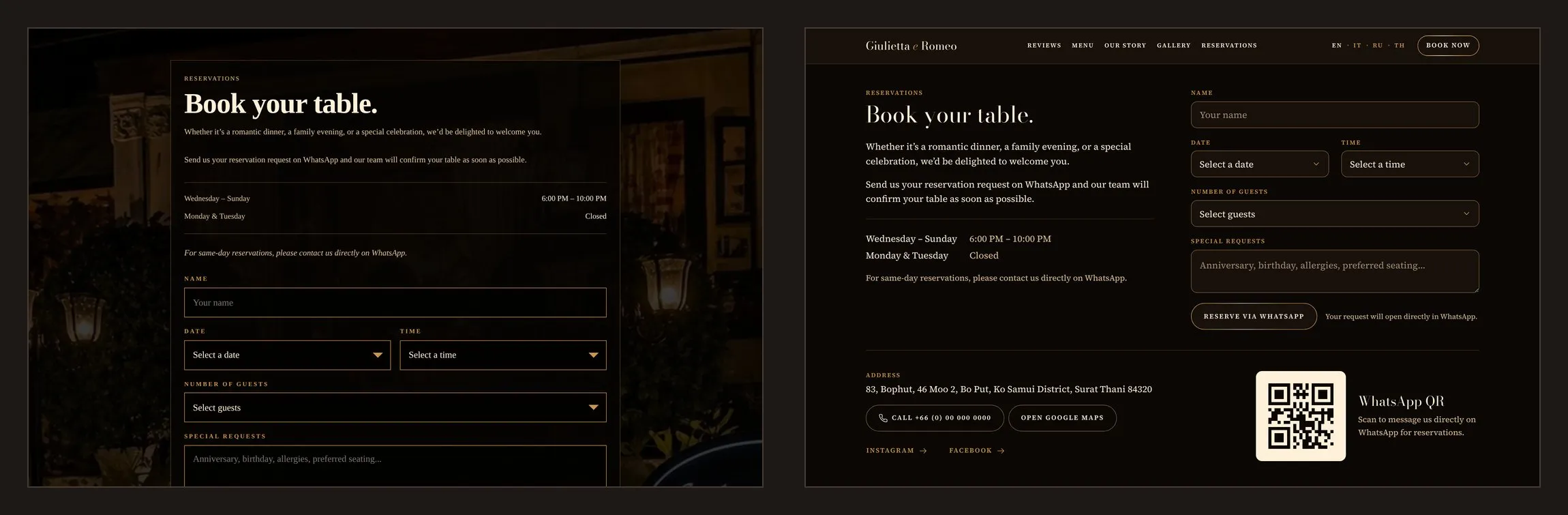
Booking for 1–8 guests, in the guest’s language
The restaurant’s booking setup worked well, and I kept it: the guest fills in a form, and the restaurant’s WhatsApp opens with a ready-to-send message giving the name, date, time, and number of guests. No server is needed for this.
Some details changed. You can choose from one to eight guests, not only 2, 4, 6, or 8; this is a question for the owner, and if it was meant to match table sizes, I’ll put it back the way it was. The form’s labels are in the language of the page, and the message always reaches the staff in English, in the format they’re used to. The bottom bar with WhatsApp and the call button no longer covers the form: it hides when you reach the form. The WhatsApp QR code was redrawn from the same link: a phone couldn’t scan the old code on the dark page.
On the test version, the restaurant’s number is replaced with a placeholder: the form opens WhatsApp with a ready-to-send message but no recipient, and the call button doesn’t call anyone.
Four languages instead of one
English is the main language, and it is the restaurant’s own text, unchanged. Next to it are Russian, Italian, and Thai versions, each with its own address and a switcher in the header; the site doesn’t redirect anyone anywhere, and the guest chooses the language themselves. The prices are the same in every language.
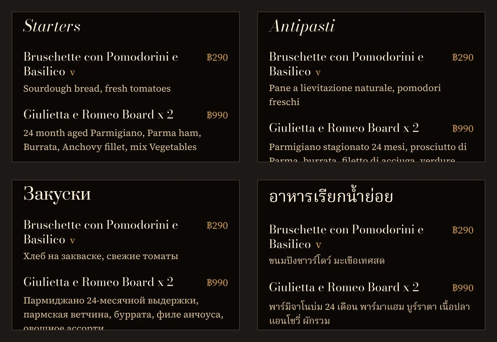
The translations are drafts for now. Each one was read by a separate reviewer, but native speakers haven’t proofread them yet, so each version will go live at the restaurant’s address only after proofreading. Under the plan I proposed to the owner, she proofreads the Italian herself, a Thai member of the restaurant’s staff proofreads the Thai, and I proofread the Russian.
The site became lightweight
The photos are no longer built into the page: each one is a separate file in a modern format, sized to the screen width, loads when the guest scrolls to it, and stays in the browser for next time. The fonts are the site’s own, so the site looks the same on iPhone, Android, and Windows, whereas before, each device displayed it in its own font. A language’s font loads only on its own page: someone reading in English doesn’t need the Thai font.
Search engines and AI assistants understand it is a restaurant
For search engines, the page has structured data: the restaurant, its address, opening hours, phone number, cuisine, and the whole menu with prices in baht, and, alongside the restaurant, La Dolce Vita and La Pasta. The language versions are linked to each other, and there is a sitemap. For AI assistants there is a short map of the site with the address, hours, contact details, and menu: people ask them where to have dinner too. All of this is assembled from the restaurant’s text, without a single new phrase, and the build checks that as well.
A link sent on WhatsApp or Telegram arrives with a photo of the restaurant; before, it had no picture. The test address is closed to search engines: a copy of the restaurant’s website won’t appear on Google.
I didn’t make judgment calls for the owner
I didn’t rewrite the text even where it would have helped AI search: questions in place of headings and a block of common questions need new phrases, and the text is the owner’s. Whatever was unclear went to her as questions, not silent fixes: which of the two spellings of the address is right, whether the photo with the sign shows the new place, and where the La Pasta button for ordering via Grab and LINE MAN should lead. The things I decided myself (the baht sign on the prices, one to eight guests, and the new order of the blocks) also went to her for confirmation. There are no new words on the site.
Want your website to be just as easy to read on a phone?
Message meResults
There are no visit or booking numbers in this case study: the site is still at a test address. But page weight can be measured right now, the same way for the old site and the new one.
| Metric | Old site | New site | Change |
|---|---|---|---|
| On opening the site | 6.4 MB | 0.3 MB | 21× less |
| Scrolled to the end | 6.4 MB | 0.8 MB | 8× less |
For a guest, this means the site opens faster on mobile internet and when roaming, and uses almost no data. And the first thing they get is what they came for: the name, the photo, and the booking button.
Measured on October 11, 2026: the same browser with a 390-pixel phone screen, without using anything already saved in the browser. The old site was measured at the restaurant’s address, the new one at the test address. Everything the phone downloaded over the network was counted: on opening, until the page stopped loading; “to the end,” after scrolling down to the footer. The old site’s file itself is 8.5 MB; over the network it compresses to 6.4, and nothing more is downloaded after scrolling. This measurement can’t tell how many people will open the site and book a table: the new site isn’t at the restaurant’s address yet.
What changed for the worse
14.6 → 17.5
Page length on a phone, in screens
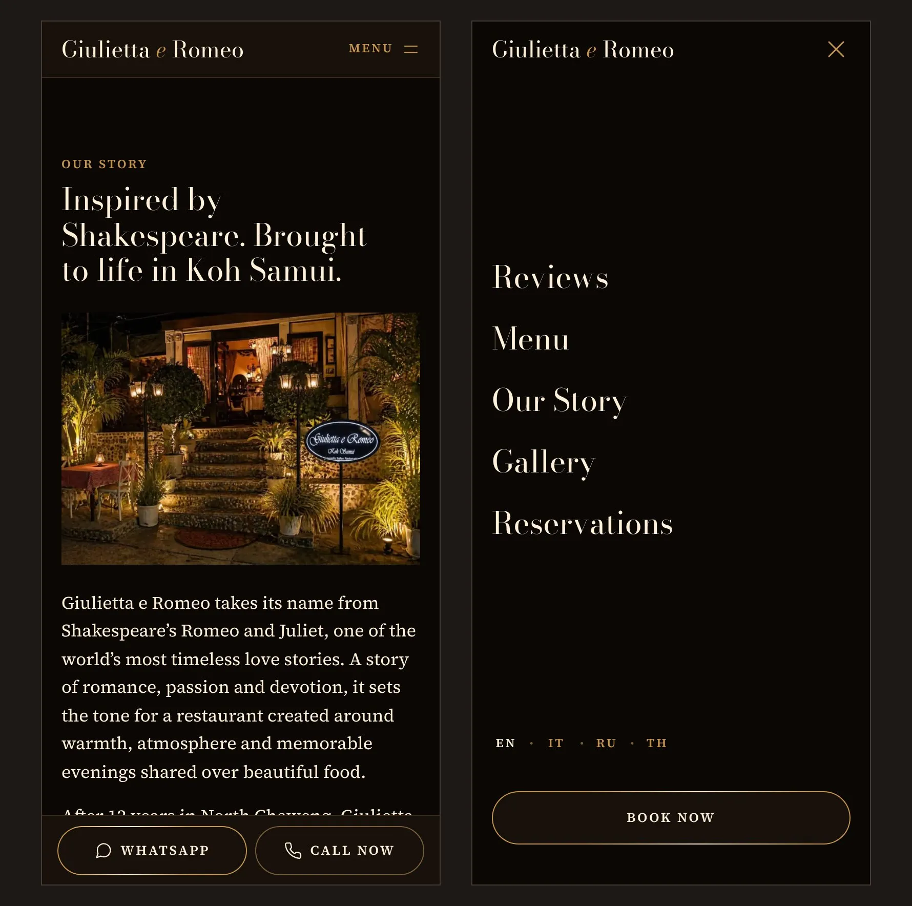
A text menu takes up more room than three pictures, and the booking form moved further down. But there is a booking button on the first screen and in the site’s section menu, and after the first screen, WhatsApp and call buttons appear at the bottom, so there is no need to scroll to the form to book.
What this gives the restaurant going forward
How will the site move to the restaurant’s address?
If the owner agrees, the new site will take the place of the old one, and the address will stay the same: links from maps and social media already lead to it. This requires her answers, proofreading of the translations, and access to the domain. After the move, the site is opened to search engines and connected to the dashboards of Google and Yandex, a search engine used in Russia.
What if the menu or a price changes?
The menu lives in one file: a dish’s name and price are written there once and carry over on their own to all four languages, the search markup, and the map for AI assistants. The translated descriptions are one file per language.
What could be added as a next step?
These are suggestions; they are not on the site. Pages of their own for La Dolce Vita and La Pasta, with menus, hours, and order buttons, instead of sending the guest to Instagram. Booking through LINE on the Thai page: for Thai guests, LINE is the main messenger. A photo of the chef next to the paragraph about her. And a short second address for business cards and table menus.
How it works technically
Astro, static only: the output is plain files, and no application server is
needed. Four language versions from one template (/, /it/, /ru/, /th/),
Astro’s built-in i18n with no redirect by browser language; each language has
a status in a registry: published goes into any build, draft only into dev
and the demo. The text is JSON dictionaries per language; the English one is
checked word for word against the transcribed original (check-content), the
translations for completeness (check-i18n). The menu is one JSON of 41 items:
names and prices are shared, descriptions and section headings are per
language.
Photos go through astro:assets, AVIF and WebP in several widths, lazy-loaded
below the first screen. Fonts are Bodoni Moda and Source Serif 4, Prata for
Russian, Noto Serif Thai for Thai; lightweight copies with only the site’s
weights, self-hosted, by page language. The scripts are the site’s own, in
TypeScript: the booking form, the bottom bar, photo zoom, the phone menu;
without them the page is still readable, and the form leads to WhatsApp as
a plain link.
JSON-LD markup: WebSite, WebPage, Restaurant with the address in parts, opening
hours, and the menu (Menu, MenuSection, MenuItem with a price in THB), two
FoodEstablishment entries for the sister projects. hreflang, sitemap.xml,
robots.txt naming AI crawlers, llms.txt from the English dictionary and
the menu. Open Graph with a 1200×630 image, .htaccess for Apache:
compression and long caching for hashed files.
Checks in the build: text and menu against the original, built pages, extra
files, photos without dimensions, style order. A separate check after the
build covers the weight budget: up to 450 KB for the first screen and up to
2.5 MB for the whole page. Tests: node:test for dates and the booking
message, Playwright with axe in Chromium and WebKit at widths from 320 px. The
demo: GitHub Actions → GitHub Pages, a build with noindex on every page.
Who did the work
It’s just me behind jw-dev.pro, not a studio or an agency. That means you talk directly to the person doing the work: no manager, no brief relayed through third parties, and no passing the project to another contractor partway through.
My time zone is UTC+7, the same as Bangkok and Hanoi. I build websites, Telegram bots, and automation: a task rarely ends with a page, and it usually has to be connected to what you already have running.
As time goes on, the task sounds like “build a website” less and less often. One person needs a price to be changed in one place, not on twenty pages. Another needs the channel to run without them. A third needs the whole price list to sit inside Telegram, where their customers already go every day. That’s why the list of what I do is open-ended: if your task isn’t on it, that doesn’t necessarily mean it can’t be solved.
I write case studies so that they can be checked: what was there, what was done, and how it was measured. If there is analytics data, I give the numbers and the period they cover; if it is too early to measure, I say so. You won’t find “increased sales” here: that is a promise, not a result.
Need something similar?
Whether it’s a website, a bot, or something that is now done by hand, tell me what’s going on, and I’ll tell you whether it can be solved or not.
This kind of work is the service “Small business website: a full build, ready to run.”
Your request was not sent
Your text is not lost: go back and try again. Or contact me directly: on Telegram, on WhatsApp, or by email.
If it’s easier, contact me directly: on Telegram, on WhatsApp, or by email.
Not sure what’s wrong with your website? Check it for free on Telegram: @jw_site_check_bot.
Who owns everything afterward and what happens if I disappear: answers on the home page.